
The work consists of progressional projects that currently exist respectively in ideation and as developmental concepts. They are focused on brand design - specifically demonstrating my interpretation of what the new Adelaide, South Australian logo could have been, character design - involved in the further progression of my original science fiction narrative titled Lucid Purity, a few life drawing studies and vehicle design - regarding a spaceship concept for the Double Happy Vs the Infinite Sadness: Island of Pharos competition.
The brand design ideations continue from a similar self directed project that commenced in 2nd year while I was still at university, prior to the wake and recent unveiling of the new Adelaide, South Australia (SA) logo. The project was to contribute to the 5000+ South Australian initiative group (http://5000plus.net.au/) that is involved in enhancing the state, with a proposed festival idea, to celebrate the innovative qualities SA has delivered in history, with a brand campaign.


(Previous ideations I designed, for a new logo to represent Adelaide, South Australia)
Research: Reference Images:

South Australia Art Gallery

St. Peter's Cathedral

The Adelaide Convention Centre

The Barossa Valley Vineyards
Returning back to my current work, I only recently devised these three concepts, after sparking interest from slowly hearing about it, in the last few weeks about the work being done to officially rebrand the state with a new logo.
Below is a link to an online article that speaks to the designer, who conceived the new logo, along with comments from critics and past designers, who had their logos grace this state.
http://www.adelaidenow.com.au/news/south-australia/jay-weatherill-launches-states-brand-in-light-and-sound-show-at-elder-park/story-e6frea83-1226591835952)
Still stemming from my original research and design intentions, my logo represents contours, shapes and silhouettes that highlight, what are to me this state’s most iconic structures and locations. My ambition is to transform all these elements into an amazing and yet simple design abstraction that celebrates the contemporary and traditions of SA.

Ideations I've been designing in my journal last week, towards this new concept I thought of that could represent South Australia, amidst other random pieces of work for projects I also have in the pipline for future JA #'s.

These elements include the steeple of the St.Peter’s Cathedral in the heart of the city, the Rundle Mall Shopping District’s artistic sculpture “The Spheres” by Bert Flugelman, the Barossa Valley renowned for it’s Wine Region - portrayed by the isometric shape positioned along the bottom of the logo, Adelaide’s beaches reflected by the outline of a wave in the background, the Adelaide Convention Centre - Adelaide’s event hub, whether it’s used for entertainment or important conferences - it’s contour line, striking halfway in the logo and layered behind The Spheres silhouette and the roman pillars that symbolise those used structurally in the form of the Adelaide Art Gallery and are a reflection of Adelaide’s proud past.
You may be wondering why an indication of the Adelaide Entertainment Centre/ Festival Theatre was omitted? The reason being as I wasn’t able to justify nor find a form that would intrinsically remind someone of it. Bare in mind that these concepts along with all other work posted in the Journal Ambience blog, are works in progress and are by no means final and thus open to improvement.
The second piece of work is another revisit of a prior project that again was commenced during my tenure at university. The idea is that it is an original narrative created by myself suited to the medium of games. The basic premise is that it is a story that fictionally adapts the works of revered theorists of many different fields, in order to convey their teachings and discoveries in an entertaining yet still thought provoking way. So far the theorists include: Edward De Bono, Daniel H. Pink, Tony and Barry Buzan and Bruce Block. This arose after being inspired by films: Inception and 8 1/2 and the game Killer 7, with an added desire, to share this interesting knowledge I was taught, while studying design, to many people, who may be unfamiliar, with what these individuals have crafted. At the moment the plot, motive and climax/ resolution of the narrative have yet to be properly devised, but the direction and characters are quite clear in my mind that I feel I am able to proceed designing. Previously I had drawn facial concepts of several of the characters and further fleshed out the anatomical construction, costume, facial expressions and orthographics of the protagonist, who at this stage is named Dr. Edward Cogni. Additionally the protagonist’s tool, it’s functionality and how Edward interacts with it, have already begun to be explored, which also intertwines the gameplay mechanics of the game. These can be found already, by clicking the “characters/ creatures” and “props” page tabs of the blog.
The web link to those pages are listed below:
Characters/ Creatures Page Tab
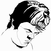
For Ideation facial studies of the cast of hero characters in Lucid Purity)
http://marcforzadesign.blogspot.com.au/p/characterscreatures.html
Props Page Tab:
For concept draft of the protagonist’s tool, which also ties into the explanation for the game’s gameplay mechanics
(26/3/13 - At the moment the presentation sheet demonstrating what I previously designed is not online now, but I'll post it as soon as possible)
http://marcforzadesign.blogspot.com.au/p/props.html
In continuing with this base work, I have recently begun to devise a composition that illustrates the entire cast of hero characters, that aims to emphasise their respective personalities and abilities and to convey the mood, setting and look of the world.

Amidst these projects I have also been practicing and honing my life drawing skills, observing the human body in different gestures and expressions.


 Finally I’ve been involved in designing a spaceship vehicle for the Double Happy Vs the Infinite Sadness: Island of Pharos competition.
The web link url to the competition is featured below:
http://www.doublehappyrabbits.com/index.php/competitions/70-cc0006
The brief is to “...to design and present a Quagflier”.
Essentially the Quagflier is a form of vehicle manned by a fictional alien race called the Oolark - consisting of a driver, an elite guard and two hunters. Concept art/ designs of these creatures and environments are provided on the Double Happy website, following the web link above.
Basically the Oolark are a race of raiders, whose motive is to “...chase down and capture alive the Shyala.
The vehicle they travel in is known as a Quagflier. The Quagflier is capable of easily traversing the choked swampy marshes of Pharos. Each Quagflier is capable of transporting a maximum of 20 Shyala prisoners (although in nothing resembling comfort). The wellbeing of the prisoners is not high on the list of priorities for the Oolark crew, however it is important that the Shyala arrive alive and in one piece.
Quagfliers are powered by Glitzer bugs and also use Glitzers to power the spotlights needed to track down hiding, and fleeing, Shyala. Each Oolark squad customises their Quagflier, with competition between rival squads getting pretty intense. The Quagfliers take a bit of a beating each time they go out on a raid, and so adhoc repairs between hunts is the norm. Quagfliers are fast and brutal, as are the Oolarks that use them”.
This is an extract from the entire list of back story provided by the website, on the competition’s page.
Currently I’ve sketched a concept I like and I am now further refining the thumbnail to a worked up rendered and functionally believable design. At the moment the aesthetic and functional details of the ship are being improved upon and addressed each day, whilst being sure to adhere to the competition’s requirements.

My thinking process concerning the design of the spaceship, is that it’s intended to not be too large in scale, considering only roughly 24 personnel inhabit it. So I’m contemplating the dimensions will be somewhere between what the size of the Star Wars AT-ST is and the Firefly Serenity spacecraft.
The nose section of the ship is where the spotter will be positioned, which is akin to a bunker-like structure, to protect the creature from incoming attack. The middle section is the crew’s quarters and passageway to get to different sections of the vehicle. On the exterior of this area that is visible is the airlock, for the Oolark to enter and leave the vehicle when it’s docked. Furthermore a fire escape will be implemented, with stairs running along the outside of the vessel, creating an entry point from the crew quarters. This is in case of emergencies so that the crew can flee this way, if the ship crashes. The back segment of the craft is where the engine and other componentry are housed, as well as where the vacuum generator is situated that the Oolark use to capture glitzers with, to power the vessel, while on journeys. The glitzers are also stored in a chamber that the Oolark crew can observe and check the quantity they have attained, which is positioned where the crew quarters is. The pointed shaped end of the ship, below the engineering area acts as both one part of the ship’s anchor/ landing device and is the prison quarters, where the captured Shyala are confined. Limited windowing and horrid conditions in this branch of the vessel, signal the lack of morality of the Oolark, as expressed in the brief, thus providing quarters similar to a jar with small holes in it, to trap and yet still marginally keep alive insects. Speaking earlier of landing devices, the other developed brakes are the telescopic steel and rectangular struts, which shift in and out of the housings, located on the sides of the engineering section. These devices coupled together, create a triangular anchored system that work by digging into the surface below that the ship hovers above. The final aspect of the ship is the cockpit, operated by the driver, who sits in a cabin overlooking the rest of the ship. This is designed to mirror the bottom section of the craft and was influenced by the form of a scorpion tail and the crow’s nest of a traditional ship.
Overall I hope you have all enjoyed this body of work and please look forward to hopefully next week, in the next given post.
As usual remember to stay tuned every Friday, or at the least please be prepared for any delays, but that will come with notifications, to explain the post’s absence.
Also please like and follow my other domains at
www.marcforzadesign.blogspot.com
http://au.linkedin.com/pub/marc-forza/1a/681/b78
http://dbvc-grad.com/students/marc-forza http://marcforza.cghub.com/
http://www.sketchtheatre.com/profile/
I also do in fact have a DeviantArt profile, but please keep in mind it has yet to be updated properly. You can find it below at:
http://mforza1987.deviantart.com/
Please feel free to leave your opinions and constructive advice below and on the blog.
Thank you.
No comments:
Post a Comment