After a bit of a hiatus, Journal Ambience returns for its eleventh edition, to share with you all, a range of new designs and art work. This consists of work based on brand design, character design and life drawing.
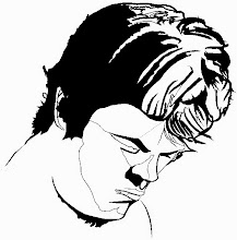
The order of proceedings begins with character design - one aspect of a large scale and ongoing personal project, which I began in 2012 as a university assignment. The project consists of a narrative and concept art/designs for an original game, being written by myself which I have titled “Lucid Purity”. You all may have already seen my prior work on the Marc Forza Design blog under the “Characters/Creatures” page tab, but if you haven’t here is an evolution of the protagonist:
Current Design
All the characters are loosely based upon various theorists, whom have all shaped the very framework of the creative process. You can read the full account of the story, its purpose, motivation, backgrounds of each of the characters and what inspired me in creating it, in JA #9.
In addition I’ve been advancing the design and appearance of the prop that the protagonist will be engaged with.
I’ve also been amidst in experimenting with different gestures, of how I should individually draw the other cast of characters.
The next stage of affairs, involved attending another life drawing class, at the local CDW studios. Below is my collection of illustrations, individually drawn to different set durations, of the model posing. This class had a costume theme, with what appeared to be some influence of Arabian or Egyptian dress.
Lastly I’ve been assigned to do a bit of brand design work, for potential employment with the University of South Australia’s (UniSA): Career Services - Learning and Teaching Unit devision, for a project that involves designing a new sport logo.
The scans below, reflect my initial stages of development, which like designing for any field, comprise of creating a theme board(s) that demonstrate imagery associated with the requirements of the brief, given to by the client, who requests and desires them to be implemented, within the design. I also display what imagery I’m inspired by as well, to visually highlight to the client, what is my thinking process and direction for the design. In particular for this project, UniSA provided me with links to brands of sporting teams that are associated with the university, not to mention competitive brands as well, of opposing institutional sporting clubs. The reason for this, as stipulated in the brief, is to provide me with an inclination, of the quality of branding that currently exists; to know what their expectations are, what styling is considered appropriate, in reflecting the university and or how the design I present can surpass what is present.
Theme Board
Mind Map
Afterward I begin constructing a mind map, to categorise my thoughts and ideas. This is built in conjunction with the ideation phase of ideas - loose and later towards tighter sketches of brand concepts. To also enlist in the process, of facilitating ideas, I illustrate what I like to phrase, as “Visual Familiarities/ Clichés”. These are marks, icons and or symbols that in a rudimentary manner, reflect the objective of the brief. In this case symbols, marks and icons that are identified with education and sport.
Ideation
Throughout the process of illustrating familiar visuals, I also attempted to combine them or aspects of their forms, in order to create unique graphics that could potentially be the logo I end up pursuing with. This normally boils down to a few finalist designs that I see as having potential.
Presently I have arrived at two brand concepts that I feel achieve the brief functionally and aesthetically. Before going into detail about the differences between the logos, two things that are the same about them, is that I decided to use the same colour scheme, with two variants to it and type, as used in the design of the UniSA logo, so that it naturally appears as though, it could be a part of the same family.
The first design plays on a few connotations. The three peaked block like structure in the centre is intended to symbolise a winner’s podium, which can relate to both education and sport, with regard to winning a sporting event and completing a degree. It also draws upon the familiarity of a building, which wasn’t intentional but I suppose it can work, to remind viewers that the logo represents a university/ institute. Secondly the symbol above it, is supposed to be a mortar board, for the emphasis on education being reminded of in the logo. But I also drew it in such a way that it appears to have a shape that indicates passion through ferocity in competition, due to it’s sharp pointed lines. I also angled it rightly upward, as this is the direction in western culture and in geometry in general, to reflect a positive curvature, thereby further emphasising the connection between success and celebration. Additionally I drew the mortar board in the centre, as that is the peak, universally recognised for polling first place.

Concept #1
The second design, conveys a bit more energy than the previous concept. In this case, I illustrated an abstract form of a person celebrating after winning, in a typical cheering fashion, with arms raised gracefully, whilst leaping for joy. The individual is also donning a mortar board, to signal the person’s allegiance with the university. Not to mention that this feeling of embrace is interchangeable, in expressing success in both the contexts of the education and sporting environments, to highlight graduating with a degree and succeeding in a sport event. Furthermore the directive motion of the figure is intentionally related again, to the nature of a positive curvature, thus symbolising achievement. Lastly the reason why the figure is segmentally drawn, is so as to accentuate the parts of the body in the form of letters that spell “UniSA”.
Concept #2
Finally in order to test the feasibility and appearance of the logo in its destined and intended context. I superimposed it onto an existing photograph of a UniSA sport team:
Brand Contextual Display
Overall I hope you have all enjoyed this body of work and please look forward to the next given post.
Also please like and follow my other domains at:
www.marcforzadesign.blogspot.com
http://au.linkedin.com/pub/marc-forza/1a/681/b78
http://dbvc-grad.com/students/marc-forza
http://marcforza.cghub.com/
http://www.sketchtheatre.com/profile/
I also do in fact have a DeviantArt profile, but please keep in mind it has yet to be updated properly. You can find it below at:
http://mforza1987.deviantart.com/
Please feel free to leave your opinions and constructive advice below and on the blog.
Thank you.